Nature Packs | Research

After creating a mockup, I decided to focus more on how to make an environment for my assets to sit in. Luckily, there were many tutorials and advice forums that guided me through the process, but the majority of these tutorials required the use of nature packs, ones that include items such as grass strands, bushes and trees, as well as ground textures and background images. These types of assets were new to me, so I set on looking for the best types to use for my project, as well as understand what was available to me. Because my scene is more focused on the assets I have created, I opted against creating my own nature assets, as this was something I was not yet familiar with.

What is a Nature Asset Pack?

Asset packs are a number of items that are created by one artist and shared so that it is available for other people to use as they please. Nature packs tend to include a variety of natural items, anything from grass strands and foliage, to rock and dirt materials. While many artists tend to charge for the use of their assets, there is a number of free versions available to download and uses for simple animations and compositions.

‘Grass Essentials’

In Blender Guru’s tutorial, he uses his own ‘Grass Essentials’ pack.


Introducing… The Grass Essentials

The Grass Essentials is a pack of grass models and particle systems, that you can quickly import to any scene to have beautiful grass.

uploads-1492507127469-grass_perennial_ryegrass

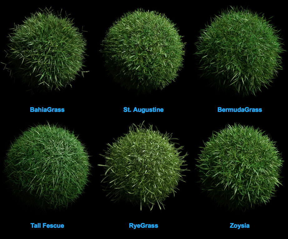
There are 15 Species of Grass, with up to 49 model variations for each.

uploads-1492507160765-grass_species-compiled-1-labeled-2

A total of 471 grass models for the most photorealistic scenes available.


Blender Guru has a rather strong opinion on Blender’s particle system, claiming that “Blender’s strands are long and singular, which makes them great for hair and fur which is consistent; but grass is wayyyy more complex. It’s got sprouts, seeds, color variations, skinny parts, fat parts and flat leaves just to name a few” (BlenderGuru,2018).

Screen Shot 2018-04-26 at 15.23.56

While this pack would normally cost $84, he offers his subscribers some free assets to use if they try to recreate this tutorial. These assets are pretty useful, I still wanted to find more options for my grass particles, so that I could vary the types and the height of my field, making it look more natural.

He offers the following pieces, as well as some other pieces that could be useful for my final images:

‘Realistic Nature Asset Pack’

CG Geek also uses his own realistic nature asset pack.


Easily Add Realistic Nature in Blender!

Tired of spending hours tediously modeling and texturing nature assets for all your scenes? So was I! And that’s why I’ve created this pack of 19 different nature models to quickly add realistic nature to any render!

uploads-1490935617139-1080p+Buttercup+field

Features

• 17 Professionally modeled and textured nature assets • 3 Rock models • 5  Grass models • 4 Flower models • 5 Weed/leaf models • 17 Unique nature textures • Easy to use material groups • Randomizing color on all assets • Easily add Subsurface Scattering • Glossy and Bump settings

uploads-1490935698612-All_Assests

This cheaper alternative to the first pack proves to be just as detailed at 10% of the price. Despite this factor, I chose to use the free assets Blender Guru offers as I was not prepared to spend money on part of my image that is not the focal point. While the environment will undoubtedly make my image, it is also not the core aim of my project.

In his tutorial, CG Geek shared the following image textures, textures I used while following his tutorial.

He also offered the following HDRI environment map, taken from HDRI Haven.

pond

“Grass Free”

While browsing the comment section of CG Geek’s video, A subscriber shared a link to a free grass pack that included simple strands that seemed almost as detailed as his own asset pack.

4

A month ago, we were thinking about the other thing that could be useful for people, a Grass Pack. About all the month of April we were concentrated a lot on the new project, and we planned to set it Free because we thought people need essential things for Free. This Pack of 3D Grass was done to get most low poly models as possible, but using realistic materials. We compared it with Grass Essentials and we were happy that Grass Free was about 3x faster in Rendering time. This was amazing! So people now have all the Types they want, for faster renderings and for Free this is how Grass Free was born. Because our goal is: “Blender is Free, so essential things must be setted Free “

Screen Shot 2018-04-27 at 09.36.05

Screen Shot 2018-04-27 at 09.36.13

After experimentation, I found that this pack gave a somewhat realistic outcome, so chose to resort to this pack for any extra gras strands I wanted to add to my scene.


Sources:

– BlenderGuru (2018). The Grass Essentials. [online] Blender Market. Available at: https://blendermarket.com/products/the-grass-essentials [Accessed 27 Apr. 2018].

– Zaal, G. (2018). HDRI Haven. [online] HDRI Haven. Available at: https://hdrihaven.com [Accessed 27 Apr. 2018].

– 3d-wolf.com. (2018). Grass. [online] Available at: https://www.3d-wolf.com/products/grass.html [Accessed 27 Apr. 2018].
Filmic Blender | Research

What is Filmic?

Filmic in Blender helps to add dynamic improvement to final renders.

It’s an OpenColorIO configuration crafted by Troy Sobotka and meant to eventually replace Blender’s current sRGB EOTF configuration with a far more closer-to-photorealistic view transform.

To break it down, that means that the linear render data that Cycles internally creates will be translated into a far better looking image. You’ll have better highlights, better dynamic range and the way light and color look will just be amazing and more natural. Even though it may seem subtle, it’s a real game changer.

When I first saw some filmic Blender examples on Twitter, I couldn’t exactly pinpoint why the renderings looked so much better, much more realistic. So I just had to try it myself. I downloaded the repository, replaced the color management files in Blender (which is easy – just copy and paste) and rendered the scene.

Unfortunately though, it didn’t really look like the examples in the renders and it wasn’t really improved. But talking to Troy, asking questions and seeing other ‘imagers’ use it, helped a lot. Being used to render with sRGB view transform and the tricks you have to use to make things look good were actually the problem. With filmic blender you don’t really have to cheat like you were used to and you can use way more realistic values when it comes to setting up lights.

Bassam Kurdali summed it up on Twitter:  “When I first used it, I had the same experience other people did: I threw the luts on a scene already lit to see ‘how better it would get’. The reason is simple – I had tweaked the lights, materials, setup in my scene with all sorts of hacks to make it look good. The trick is to start a new scene, and light it with intensities that mimic better real light – typically much higher than we used. It’s so much more forgiving: smooth roll offs + wide range > clipping, pretty bounce/light wrap effects, sweet hilights”

I was first introduced to this option by my tutor and used it in my final render.

Saucepan Issues | Development

When appending my assets into one file, I noticed a rather drastic change in the rendering times compared to earlier versions of my scene. While the scene is detailed, the rendering time took a drastically long time, especially since I was yet to apply textures to any of the assets present. The longest process seemed to be the synchronisation of the objects, so I turned to google to try and find some answers.

One thread I found suggested that it was an issue with RAM. Having attempted to render this mockup on my laptop, I chose to try the same on a computer with larger capabilities, but I was still left with the same issues.

Thread: 2.66, Cycles is Stuck Synchronizing Objects

First mock up values
First mockup values

After a lot of deliberation, I noticed that the values at the top of the Blender document were excessively high, something I was not sure of until I discussed the issue with my tutor. As I had made a point during my modelling processes to remove as many unwanted faces as possible, I assumed this value was correct, however, decided to check each asset again to find the source of the problem. In doing so, I found that the saucepan formed a large amount of those values, leading me to remove it from the scene.

The values of the mockup with the saucepan removed
The values of the saucepan alone

Removing this asset radically reduced the rendering time, so my next task was to figure out how to include the saucepan into the scene without affecting the values. My first instinct was to recreate the saucepan, as the shape was rather simple and I was confident I could do it in a reasonable amount of time, but when discussing the issue with my tutor, he suggested I just import the OBJ I created in preparation for substance painter. I chose to do so, as I was rather pleased with the outcome of my model, and would have rushed to get another version finished in a reasonable amount of time.

When importing the OBJ, I was faced with some nodes I needed to remove before adding the textures I wanted. These were simple enough to deal with, as all I needed to do was delete them completely and paste the appropriate node sequence.

Screen Shot 2018-04-26 at 13.55.49

After making this alteration, I was able to export the following mockup in no time.

Final Mockup:

Shot 5

My Final Assets | Development

In order to gain an idea of what surroundings I wanted my final scene to have, I decided to append each asset into one document and place them in the formation I wanted them to take. When doing so, I realised there was a large problem with my saucepan, an issue I will address in another post, but for the time being, I decided to render these stills without the saucepan, as that smaller asset could be quickly added once the error is solved.

Shot 1 Shot 2 Shot 3 Shot 4

Modelling Process – Tent | Development

Intended Outcome:

  • Finish designing and modelling the tent for my scene.

Problems I encountered and how I overcame them:

  • When I began this project, I had already undergone a few testing and experimentation trials, attempting to create a simple triangular tent, and in doing so I learnt so much. When modelling the first tent, it was the first time I had attempted to UV unwrap fabric and I came across a few problems. When I first uploaded my mesh to substance painter, I was confronted with the below problem. During the modelling process, I was unaware that I needed to apply a solidify modifier to ensure the tent had normals on both sides of the sheet. Because of this, Substance painter did not acknowledge these sides, so I consulted my tutor during a masterclass and he taught me about the solidify modifier, and I was able to fix this issue.

Screen Shot 2018-02-06 at 16.11.53

  • After solving the above issue, I felt confident in using planes to create the fabric for my tent. The initial image I used had a rather interesting designed tent, almost a gazebo type cover, which I felt fit the idea I had for my scene. Because of this, I focussed on following the reference image as closely as possible.

c8038eef9c83faefc5e9c44e090c0f6d

  • To set the proportions of my tent, I began this model by designing the poles that prop the fabric up. To do this, I user rather basic tools in Blender, extruding, indenting and spinning a cylinder so that it had a hook at the top of the pole. In real life, this hook would piecer through the fabric, however as the top of the tent will not be shown in too much detail, I chose only to simulate this piece rather than replicate it exactly, and I was not confident in adding holes to the fabric that would have a cloth simulation.
  • From being rather nervous to work with planes, I found that they worked just as they would if I was working with a 3D mesh, the complicated part of this process for me was pinning the fabric. I experimented heavily with pinning fabric before doing this project, however, therefore I was able to choose and apply the cloth simulation to act as I desired. I tested this with a wind force field to ensure it moved realistically.
  • After adding the fabric, I added rope to simulate the pieces holding the tent up. I did not film this, therefore it is not included in my timelapse, but to summarise, I created a long thin cylinder, attaching it to the top of both larger poles, and ensured they were touching both the top of the pole and the ground, going off at an appropriate angle.

Screen Shot 2018-04-26 at 12.33.28

  • To complete this model, I added a subdivision surface modifier to smoothen the surface, I bevelled any edges that were too harsh, and I ensured that the normals of the mesh had an auto smooth angle of 30 degrees. I also grouped together any items that would be textured the same.

Timelapse:

Final Model: